Latest news about Bitcoin and all cryptocurrencies. Your daily crypto news habit.
I love my iPhone.
The details and user experience are mostly delightful.
However… about 2–4 times a day, a moment of intense frustration pops in. Turning the otherwise smooth experience into total chaos.
Let me illustrate.
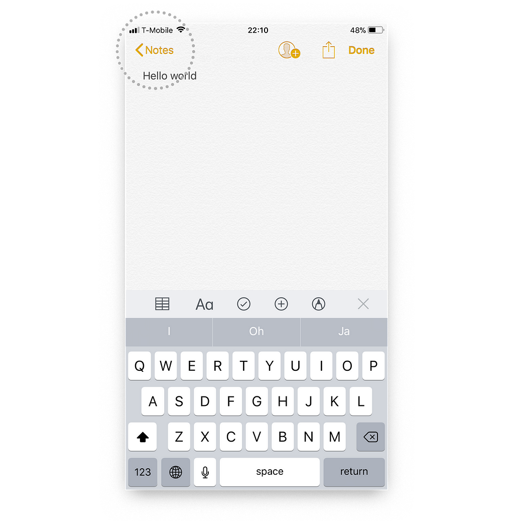
Say I‘m inside the Notes app. I decide to go back and edit one of my previous notes.
So… I move my finger to the “< Notes” button in the upper left corner.
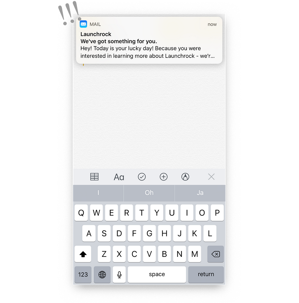
A split second before my finger touches the glass, a popup appears in the wild!
I accidentally tap the notification and I’m taken into an entirely different app, away from where I intended to be.
Similar to those random enemies that appear in japanese RPGs, you’re taken out of your peaceful journey, straight into fierce battle mode.
By the time I’ve navigated back to the Notes app and performed the originally intended action, I’ve experienced pure agony for about 2 seconds.
2 seconds of agony, 3 times a day, that’s about 0.6 hours a year.
If only 0.002% of the 700M+ iPhone users have a similar experience on a daily basis, collectively these notifications are causing over 8400 hours a year of pain to users.
Having been through this experience way too many times, I find myself regularly being forced to turn on the “do not disturb” mode to block potential popups from disrupting my flow. It saves me from flashes of agony but it’s not at all ideal.
As a UI designer at www.fairpixels.pro, I spend my days searching for and solving problems like these for startups.
So I decided to find a solution for this problem and redesign the popup, hoping that Apple picks it up and pushes a fix in the next iOS update.
First, let’s analyse the root of the matter:
The vast majority of times this problem occurs when trying to tap one of the action items in the top corners. A ton of apps utilise those corners for key navigational functions. The current notifications block these action items at random moments that lead to accidental taps, causing abrupt changes in the user’s flow.
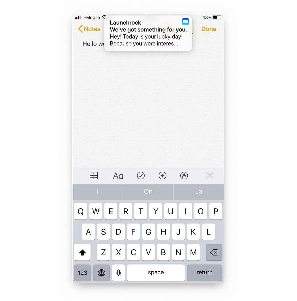
This UX glitch can be solved with a tiny UI update:
By just changing the width of the popup, the action items in the top left and right corners are not covered anymore and 90% of the accidental taps can be eliminated.
Tiny changes like these can have enormous impact on the emotions users experience when using a product. It’s our ongoing mission as UI & UX designers to identify friction points like these in products and craft elegant solutions.
I hope Apple pushes a fix and makes the (mostly great) iPhone experience even more delightful.
— Karim, UI designer @ Fairpixels.pro
Dear Apple, please fix notifications. was originally published in Hacker Noon on Medium, where people are continuing the conversation by highlighting and responding to this story.
Disclaimer
The views and opinions expressed in this article are solely those of the authors and do not reflect the views of Bitcoin Insider. Every investment and trading move involves risk - this is especially true for cryptocurrencies given their volatility. We strongly advise our readers to conduct their own research when making a decision.


