Latest news about Bitcoin and all cryptocurrencies. Your daily crypto news habit.
Data Science for Javascript Developers — A Tutorial
I love Javascript. I think it is a great programming language. It is a versatile, constantly evolving, ever growing language. It is practically the only language that runs both on the client and server. NPM, node’s packaging system, is great. For many, Javascript is their first (and sometimes only) programming language. But when it comes to data science, it is all about Python (or R). While Python is a great programming language, I don’t see any reason Python should be more suitable for data science than Javascript. They are both interpreted, non-typed programming languages. They both can wrap around C libraries for computationally intensive code. Yet, today, data science is done in Python.
The goal of this tutorial is to open the door to data science programming using Javascript. This tutorial is intended for Javascript programmers without any data science experience. My next post is about Text Analysis. You can read it here.
Jupyter Notebooks
A great data science tool that was initially created for Python is Jupyter Notebook. I like to think of it as a really sophisticated console combined with REPL programming. A notebook is a sequence of cells. Each cell may contain code, that can be executed and its output displayed right after the code. The context is kept from cell to cell i.e. variables declared in the first cell can be accessed from subsequent cells. The magic is in that while consoles can only display character based output, notebooks can display visuals, such as HTML, SVG and images. This is extremely important with data science where visualization is key to understanding the data. Notebooks, when used in data science, typically display tables, graphs and other data visualizations. It cannot be done using plain old command line
This is just the basics. Here are some features that make notebooks really cool:
- You can execute and re-execute code. The output is stored in the notebook
- You can add markdown cells, documenting the work you do. This makes notebooks a really good tool for demonstrating code and programming ideas
- You can set checkpoints while developing the notebook and rollback to them if whatever you did trashed the notebook
- You can download the notebook in various formats (HTML, PDF etc.) and share them. You can view an HTML download with the code in this post here.
Jupyter notebook was initially developed for Python environments, so the code in the cells could only by python. As the platform evolved, additional languages (called kernels) were added. In this tutorial, we will use the Javascript kernel IJavascript which makes it possible to run Javascript code. Another possible option for developing notebooks in Javascript is the PixieDust kernel with the node plugin. If you want to go the “PixieDust way”, I recommend Glynn Bird’s excellent post series. Start with part one.
Dstools NPM Package
I created a node package named dstools To make using Javascript for data science a bit easier. It supports jQuery style chaining and wraps around other useful data analysis packages such as jStat for statistical analysis, csv for csv file import and Plotly for data visualization. You can also use these libraries directly instead of the dstools package, but our tutorial relies on it.
The Tutorial Data
Kaggle is a great source for learning data science and machine learning. It contains great notebooks that teach data science and hosts public datasets that can be used to demonstrate data science concepts. Unfortunately, Kaggle does not support Javascript notebooks (yet). This tutorial is loosely based on the Python notebook comprehensive data exploration with Python by Pedro Marcelino, analyzing the House Prices dataset. You will need to download one of the files in the dataset to run through the tutorial.
Getting Started
We are done with the introduction. Let’s start coding.
Installing Jupyter Notebook
First, we will need to install the Jupyter Notebook. This is a Python based web server used to manage, create and use Jupyter notebooks. The notebook’s interface is web based. You can find installation instructions over here. Note that the recommended installation method is using Anaconda. Anaconda is a Python package management and distribution tool. Jupyter is included in the Anaconda distribution.
After installing Jupyter, you can start the notebook server
$ jupyter notebook
By default, the server resides on port 8888, and can be access from the browser at http://localhost:8888. You will see the Jupyter logo and the ‘Files’ tab open with a file system view. On the right of the screen you will see a “new” button. Clicking on it will show a menu of possible notebook formats. You will probably see in the list “Python” but not “Javascript”. For that, you will need to install the IJavascript kernel.
Installing Javascript Kernel
Follow the instructions at https://github.com/n-riesco/ijavascript#installation. Notice that you need to use the ijsinstall utility to allow Jupyter to use the Javascript kernel.
Creating a Javascript Notebook
After installing the IJavascript kernel, clicking the “New” button in the Jupyter server home page, will show the option for creating a “Javascript (Node.js)” notebook. Choose that option and create the Javascript notebook. It will open an empty notebook with a single empty code cell.
Write the following totally unpredictable code into the cell:
console.log('Hello World');and the text will appear in your notebook.
As you can see, the output is printed after the code cell.
This is a great for plain text, but notebooks are here for visualization. The IJavascript kernel provides a global object $$ that can be used for notebook communication and display. For example, the following code prints HTML output. This is a screen shot of the code cell and the output following it:
We will not get into the details of IJavascript API. You can read more about it here.
Installing dstools package
We will need the dstools package in order to run this tutorial. The package should be installed from the same directory of the notebook. Simple install it using npm.
$ npm install dstools
Editing a notebook is pretty straight forward. You can use buttons, menus or shortcuts. Executing the selected cell is done using Ctrl+Enter. If for some reason the kernel is stuck or you just need to restart the kernel, use the Kernel menu item for restart.
If you wish, you can view, download and run this notebook on your own computer. The notebook is on github or you can view the static HTML download.
So let’s get started.
Loading the Data
Data Science doesn’t mean much without the data. In this tutorial we are using the House Prices dataset hosted by Kaggle. Download the train.csv file from https://www.kaggle.com/c/house-prices-advanced-regression-techniques/data. Have a look at the data fields description to better understand the data. Download the file and store it in your file system.
Most datasets are stored in csv format. We will use the dstools package to load the data.
ds = require('dstools');train = ds.Collection().loadCSV('/path/to/data/houseprices/train.csv')The ds.Collection function creates a collection wrapper object. The various dstools functions can then be chained to the wrapper object, just like jQuery functions are chained to the jQuery object. We are using here the loadCSV function to load the data. It is stored inside the wrapper as an array of objects, each object representing a data point. The objects properties are the data point features (or fields).
It is useful to view the first few rows to get a feel for the data. The head function returns a collection with the first n rows. the show function displays the data table.
train.head(5).show();
Each row is a data point representing a house sale. There are quite a few fields (features) for each data point. The most important field is the last one, SalePrice. A description of the data fields can be found in the “data description.txt” file in the data repository. Some fields are quantitative, i.e. they have a numerical value, like SalePrice. Others represents categories like PavedDrive which can be one of Y (yes), P (partial) or N (no). A description of the possible categories for each field can be found in the “description.text” file.
Analyzing Distribution
Next, we want to better understand the house price feature of our data collection. A significant concept in statistics is distribution.
probability distribution is a mathematical function that, stated in simple terms, can be thought of as providing the probabilities of occurrence of different possible outcomes in an experiment. For instance, if the random variable X is used to denote the outcome of a coin toss (“the experiment”), then the probability distribution of X would take the value 0.5 for X = heads, and 0.5 for X = tails (assuming the coin is fair).
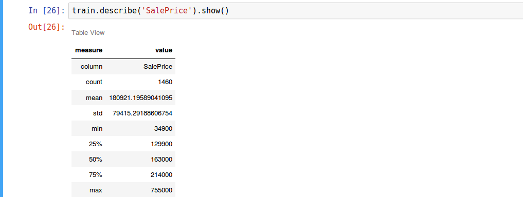
First, we will use the dstools function describe to get some basic understanding of the HousePrice distribution. The describe function shows the most important distribution measures.
We can see the mean value is about 180,921 with standard deviation of 79,415. The quartiles gives us a better understanding of the prices the bulk of the houses were sold for. 50% of the houses were sold for prices between 129,900 and 214,000 (between the 25% and 75% quartiles).
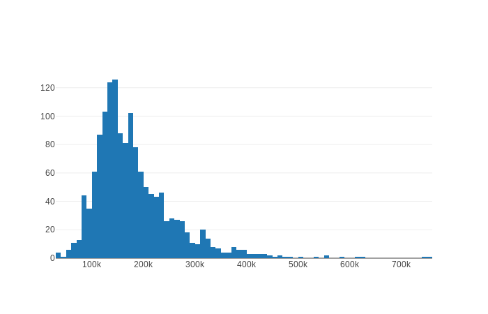
The describe function gave us a general idea of the distribution, but we would really like to visualize the distribution. Seeing is believing is understanding. We use histograms for that.
For data visualization, we use the excellent plotly Javascript library wrapped in the dstools package. Showing a visualization of the data is done by chaining the plotly function to the data wrapper. You can find documentation for using plotly here. When using plotly with dstools, the plotly function creates the HTML visualization. You need to chain it with the show function to display the plot. The plotly function replaces x and y properties with the column data (this our case, the column ‘SalePrice’). If the value of x is this, its value is set to the contained data itself. This is useful when wrapping vectors rather than datasets.
train.plotly([{type:'histogram',x:'SalePrice'}]).show();The histogram sorts all house prices and puts them in bins. Each bin represents a range of prices. The Y axis shows how many data points are in each bin.
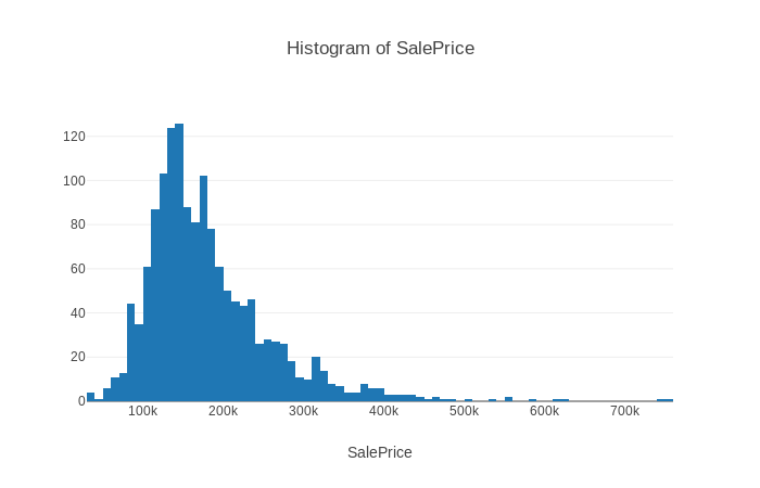
The dstools module provides convenience functions for all visualizations in this tutorial including histograms. The histogram function takes one argument, the name of the field to show in the histogram.
train.histogram('SalePrice').show();From viewing the histogram, we can see that the sale price distribution is centered around 126K. We can also see that the distribution is skewed, or asymmetrical. Here’s what Wikipedia has to say about skewness:
In probability theory and statistics, skewness is a measure of the asymmetry of the probability distribution of a real-valued random variable about its mean. The skewness value can be positive or negative, or undefined.
Skewness value of 0 means the distribution is not skewed. A negative skewness indicates that the distribution is left skewed and a positive skewness indicates the distribution is right skewed.
We can measure skewness using the skewness function. Skewness is a primitive value (number), so there is no need to chain the show function.
train.skewness('SalePrice');//1.8809407460340324Another interesting measure of distribution is kurtosis, measuring the tailedenss of the distribution. In Wikipedia’s words:
In probability theory and statistics, kurtosis (from Greek: κυρτός, kyrtos or kurtos, meaning “curved, arching”) is a measure of the “tailedness” of the probability distribution of a real-valued random variable
The higher the value, the more data points are in the tail and the tail is longer. Normal distribution has the value of 0.
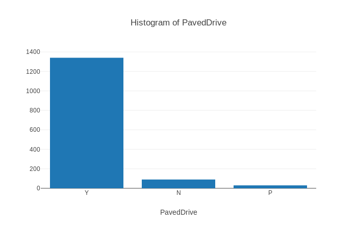
train.kurtosis('SalePrice');//6.509812011089419It is possible, of course, to show histograms of categorical fields such as PavedDrive. The histogram will show the number of data points with each PavedDrive category. Not surprisingly, almost all sales were of houses with paved drives.
Finding Relationships Between Features
So we understand now the distribution of house prices, but we are really interested in exploring the relationships between the different features. We want to understand how the prices of houses relate to other features such as Lot Area, the year the house was built or if the house has a fireplace.
Correlation Map
The first tool we will use is the correlation map. Let’s start with the Wikipedia definition of correlation:
In statistics, dependence or association is any statistical relationship, whether causal or not, between two random variables or bivariate data. Correlation is any of a broad class of statistical relationships involving dependence, though in common usage it most often refers to how close two variables are to having a linear relationship with each other. Familiar examples of dependent phenomena include the correlation between the physical statures of parents and their offspring, and the correlation between the demand for a product and its price.
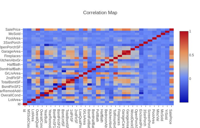
The correlation map is a heat map showing the correlation between all data point features. the corrmap function generates the correlation map for all data fields
train.corrmap().show()
Correlation can be in the range of -1 and 1. A value of 1 means the features are positively correlated i.e. they move in the same direction. Zero correlation means the featurs are not related. Negative correlation means when the value of one feature rises, the value of the other feature falls. Positive correlations are in red. Negative correlations are in blue. The correlation between two identical features is always 1. You can see that in the map with the diagonal red line.
From the correlation map we can see that “Total basement area” and “first floor area” are positively correlated. This is because the basement is usually on first floor. The features “total room above ground”, “living area” and “overall quality” are positively correlated with “sale price”. The largest the living area, the more expensive the house is. The feature “year built” is negatively correlated with the feature “enclosed porch area”. This means, newer houses have smaller porches.
Scatter Plot
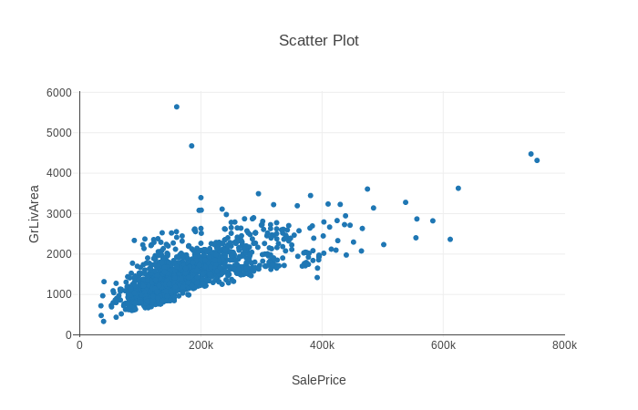
Correlation maps are great at directing our attention to interesting relationships between features. We use the scatter plot for understanding the nature of the relationship between the features. We noticed the correlation between living area and house price. Let’s view a scatter plot of the two features.
train.scatterPlot('SalePrice','GrLivArea').show();The X axis represents SalePrice. The Y axis, above ground living area. The correlation is now clear. You can image a line representing the relationship between sale price and area. You can also see the specific points that are distant from the line, like the two points between 100k and 200k at the top. These data points do not follow the general rule.
Box Plot
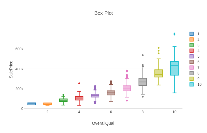
Scatter plots are good for comparing two continuous features but less so for categorical features. We can use the boxplot for that.
In this example, each box represents all data points with a particular quality score, between 1 and 10. The line in the center of the box is the median. The bottom box border is the 25% percentile and the top box border is the 75% percentile. This gives us a good idea of where 50% of the data points are (inside the box). The whiskers represent the maximum and minimum values, excluding outliers. Outliers are data point that are significantly distant from the rest of the data (more than 1.5 X interquartile range above or underneath the box). They are rendered separately. You can see, data points with overall quality of 8 have 4 outliers, 3 above the top whisker and 1 underneath the bottom whisker. Read here for a more detailed explanation of box plots.
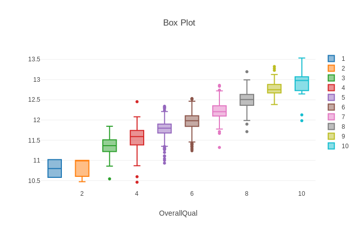
Notice that connecting the boxes creates an imaginary line, but the line is not straight. It is more like a log line. This indicates that the relationship between the two features is not linear but more like log. We can plot the log of the sale price instead of the actual sale price replacing the string SalePrice with a function.
train.boxPlot('OverallQual',(data)=>Math.log(data['SalePrice'])).show()Now we can see the boxes are closer to an imaginary straight line.
Final Words
In this tutorial we merely scratched the ground. The important lesson is that data science is possible using Javascript. Visualization can be done using front-end libraries such as plotly and Highchart. There are many packages for statistical analysis and machine learning on NPM. My next post discusses Text Analysis and word2vec model. Having all these tools available in Javascript makes data science and machine learning accessible to a much larger community of developers.
Data Science for Javascript Developers was originally published in Hacker Noon on Medium, where people are continuing the conversation by highlighting and responding to this story.
Disclaimer
The views and opinions expressed in this article are solely those of the authors and do not reflect the views of Bitcoin Insider. Every investment and trading move involves risk - this is especially true for cryptocurrencies given their volatility. We strongly advise our readers to conduct their own research when making a decision.


